
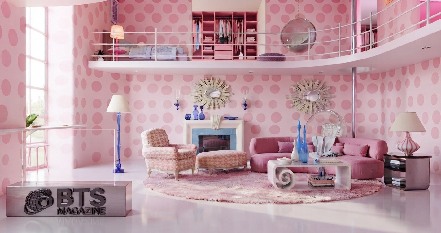
Soft pink has moved past its reputation as a color for nurseries. Designers now treat it as a functional neutral that works in living rooms, kitchens, and offices. When applied with restraint, this shade adds warmth without overwhelming a space.
This guide explains what soft pink is, why it fits modern interiors, and how to use it step by step. You will also learn common mistakes to avoid and expert tips that keep the look current.
What Is Soft Pink?
Soft pink is a muted, low-saturation shade of pink that leans toward beige, gray, or peach undertones. It reads as calm and neutral rather than bold or playful. Common versions include blush pink, dusty rose, and pale rose, each carrying a slightly different warmth.
Unlike bright fuchsia or hot pink, soft pink acts almost like a warm off-white. This means it pairs easily with other colors and works across many rooms without demanding attention.
Why Soft Pink Is Important in Modern Design
Modern interiors often rely on cool grays and stark whites, which can feel flat. Soft pink solves that problem by adding warmth while keeping the clean, understated look designers want.
Here is why the shade earns its place in contemporary homes:
- It functions as a neutral. Blush and dusty rose blend into palettes the way beige or greige does.
- It softens hard materials. Pink balances concrete, steel, and glass in industrial spaces.
- It photographs well. The tone reflects light gently, which flatters both rooms and people.
- It works year-round. Pastel tones stay fresh in spring and cozy in winter.
The result is a color that adds character without breaking the calm balance of a modern space.
Key Features and Benefits of Soft Pink
Soft pink offers practical advantages beyond looks. Understanding these helps you decide where to apply it.
- Versatility: It suits walls, furniture, textiles, and small accents equally well.
- Flexibility with metals: It pairs with brass, copper, black, and chrome fixtures.
- Mood control: The shade lowers visual tension, which makes it useful in bedrooms and reading corners.
- Easy layering: It combines with neutral palettes, so you can adjust the intensity over time.
The main benefit is control. You decide whether soft pink whispers in the background or leads the room.
Step-by-Step Guide to Using Soft Pink
Adding soft pink works best when you build the palette in stages. Follow this order to avoid a space that feels unbalanced.
- Choose your undertone. Decide between cool blush, warm peach-pink, or gray-based dusty rose. This choice anchors every other decision.
- Set the base. Use white, greige, or warm beige on large surfaces. This gives soft pink room to stand out.
- Pick the pink’s role. Decide if pink will be the main color, a secondary tone, or a small accent.
- Apply the 60-30-10 rule. Use one dominant color for 60% of the room, a secondary for 30%, and an accent for 10%. Soft pink often works best in the 30% or 10% slot.
- Add contrast. Introduce charcoal, deep green, or navy to keep the pink from feeling too sweet.
- Layer textures. Combine velvet, linen, wood, and ceramic so the color gains depth.
- Test the light. Check the shade in morning and evening light before committing, since pink shifts with lighting.
This staged method keeps your pink interior decor balanced from the first surface to the final accent.
Common Mistakes to Avoid
Soft pink fails when people treat it like a bold color instead of a neutral. Most problems trace back to a few repeat errors.
- Overusing the shade. Covering every surface in pink removes contrast and flattens the room.
- Ignoring undertones. A cool pink beside warm wood can clash and look muddy.
- Skipping dark anchors. Without a deep contrasting color, pink spaces feel washed out.
- Choosing the wrong finish. High-gloss pink can look plastic, while matte finishes read more refined.
- Matching everything. Using one exact pink across all items creates a costume effect, not a design.
Avoid these errors and soft pink stays sophisticated instead of sliding into cliché.
Expert Tips for Working With Soft Pink
Designers who use soft pink well follow a few consistent habits. These tips raise the finish from amateur to intentional.
- Pair pink with green. Plants and sage tones make blush pink look grounded and modern.
- Use it on a ceiling. A pale pink ceiling adds warmth without shrinking the room.
- Bring in natural materials. Rattan, oak, and stone stop pink from feeling artificial.
- Try pink in the kitchen. Blush cabinets with brass handles create a current, warm look.
- Start small. Test the color with cushions, art, or a single chair before painting walls.
The pattern is simple: treat soft pink as a warm neutral, and build contrast around it.
FAQs
Is soft pink still in style?
Yes. Soft pink remains popular in modern design because it works as a warm neutral. Designers use blush and dusty rose in living rooms, kitchens, and bedrooms. The shade pairs with greens, grays, and natural wood, which keeps it current rather than trendy or dated.
What colors go with soft pink?
Soft pink pairs well with charcoal, sage green, navy, white, and beige. Metals like brass and black also complement it. For contrast, add one deep color. For calm, keep the palette light. These combinations stop pink from feeling too sweet.
Is soft pink a good color for small rooms?
Yes. Soft pink reflects light gently, which makes small rooms feel warm and open. Use it on walls or ceilings with white trim to add depth. Avoid dark accents in very small spaces, since they can make the room feel closed in.
Can soft pink work in a masculine or neutral home?
Yes. Muted pinks like dusty rose read as neutral, not feminine. Paired with leather, dark wood, black metal, and concrete, the shade adds warmth to industrial and neutral interiors without shifting the overall tone of the space.
What rooms suit soft pink best?
Bedrooms, living rooms, kitchens, and home offices all suit soft pink. The shade lowers visual tension, which helps rooms feel restful. In kitchens, blush cabinets look modern. In offices, pale pink walls keep the space calm and focused.
Should I paint walls or use accents?
Start with accents if you are unsure. Cushions, art, and small furniture let you test the shade with low risk. If you like the effect, move to walls or larger pieces. This staged approach protects your budget and your design.
Conclusion
Soft pink works in modern homes because it behaves like a warm neutral, not a loud statement. Treat it that way, and the color adds comfort without disrupting a clean, current look.
The method stays consistent across every room. Choose the right undertone, build a neutral base, add contrast, and layer textures. Avoid overuse, mismatched undertones, and missing dark anchors.
Ready to refresh your space? Start with one soft pink accent this week and build from there. A single cushion or wall can show you exactly how the shade fits your home.
For additional background on the color and its history, you can also explore Pink on Wikipedia.
Read also: iOS Folder Icon: Meaning, Uses & How to Customize It