
Introduction
Open a short video on TikTok, Instagram, or YouTube Shorts, and there is a good chance it was edited with CapCut. The app has become popular because it makes video editing feel simple, even for people who have never used professional editing software.
One of the most recognizable parts of the brand is the CapCut logo. Its simple black-and-white design is easy to spot, but many users wonder what the symbol actually represents, where it came from, and why the design looks the way it does.
In this guide, we will explain the CapCut logo, its meaning, design, history, uses, and the most common questions people have about it.
What Is the CapCut Logo?
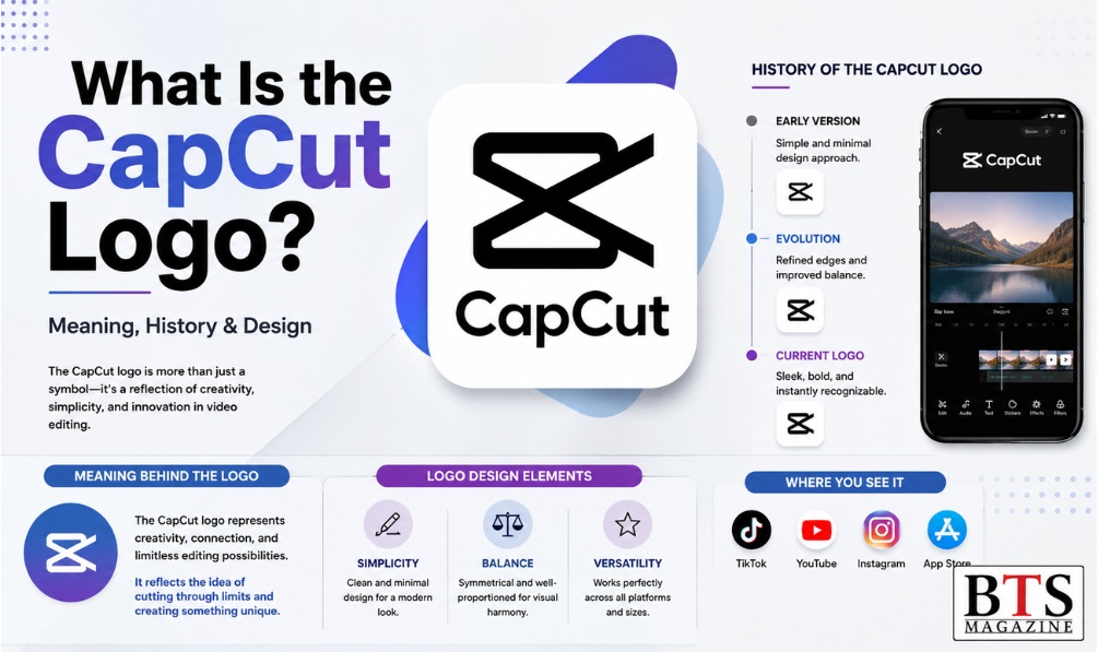
The CapCut logo is the visual symbol used to identify CapCut, a video-editing platform developed by ByteDance. The logo is mainly known for its simple black icon that resembles a stylized ribbon, loop, or crossed shape.
The design is intentionally minimal. Instead of using a detailed picture, CapCut uses a bold geometric symbol that can remain recognizable on an app icon, website, video interface, or small screen.
In simple terms: The CapCut logo is the brand’s visual identity. Its clean geometric shape represents creativity, editing, and the connection between different elements of video creation.
What Does the CapCut Symbol Mean?
The exact interpretation of a logo can depend on how viewers see its shape. The CapCut symbol is often described as looking like a stylized pair of scissors, a ribbon, or an abstract loop.
Its visual structure fits naturally with video editing because editing involves cutting, joining, arranging, and transforming visual content.
The important point is that the logo is designed to be memorable rather than to communicate one literal object.
A Brief History of the CapCut Logo
CapCut’s story is closely connected to ByteDance’s expansion into short-form video and creator tools.
The application was originally associated with the name JianYing in China and later became known internationally as CapCut. As the platform expanded into global markets, its branding became increasingly recognizable among mobile video creators.
According to ByteDance’s official information, CapCut is one of the company’s products alongside platforms such as TikTok and other digital services. ByteDance Official Website
The CapCut identity has remained relatively simple, which helps the brand work across different digital environments.
Over time, users have seen the logo across:
- Mobile app stores
- Video-editing applications
- Social media content
- Creator tutorials
- Websites
- Online advertisements
- CapCut templates
- Branded video content
Rather than relying on a complicated visual identity, CapCut uses a straightforward symbol that works well at different sizes.
Why Is the CapCut Logo Important?
A logo may look like a small part of a business, but it can have a major role in brand recognition.
When people repeatedly see the same symbol while editing videos, watching tutorials, or browsing an app store, they begin to associate that image with the product.
For CapCut, the logo helps with several important branding goals.
1. Brand Recognition
A simple symbol can be recognized quickly. Users do not need to read the complete company name every time they see the app icon.
2. Mobile-Friendly Design
CapCut is heavily used on smartphones, where screen space is limited. A clean logo remains visible even when displayed as a small application icon.
3. Professional Appearance
Minimal designs can make a digital product look modern and polished. The CapCut logo follows this approach rather than using unnecessary visual details.
4. Consistent Branding
The same basic visual identity can appear across the application, website, promotional material, and social media presence.
5. Creator Association
For many users, the logo has become associated with short-form video creation, templates, effects, transitions, and mobile editing.
Key Features of the CapCut Logo Design
The design works because it follows several basic principles of effective visual branding.
Simple Geometric Shape
The logo uses an abstract geometric form rather than a detailed illustration. This makes it easier to recognize.
Strong Contrast
The traditional black-and-white appearance creates strong visual contrast. That helps the symbol remain clear on different backgrounds and devices.
Minimal Detail
There are no unnecessary decorative elements competing for attention. The viewer can identify the basic shape quickly.
Scalable Identity
A good digital logo should work at many sizes. CapCut’s simple design can be displayed on a phone screen or used as a larger branding element without becoming visually complicated.
Modern Visual Style
The abstract shape gives the brand a modern technology-focused appearance, which suits a digital video-editing platform.
CapCut Logo vs. the CapCut Wordmark
It is useful to distinguish between a logo symbol and a wordmark.
The symbol is the recognizable graphic mark associated with CapCut. The wordmark is the written CapCut brand name.
Depending on where you see the branding, the symbol and wordmark may appear together or separately.
For example, an app icon may primarily use the symbol, while a website header may display the symbol alongside the CapCut name.
This flexible approach makes the identity useful in many different situations.
How to Find the Official CapCut Logo
If you need the CapCut logo for research or legitimate branding purposes, the safest approach is to use official CapCut or ByteDance brand resources rather than downloading an image from an unknown website.
You can start with the official CapCut website when checking current CapCut branding and product information.
When looking for a logo file, check:
- Whether the source is official.
- Whether the logo is current.
- Whether there are usage guidelines.
- Whether the file has enough resolution for your intended purpose.
- Whether commercial use is permitted.
Do not assume that an image found through Google Images is automatically free to use. Logos and other brand assets can be protected by trademark and other intellectual-property rules.
How to Download a CapCut Logo Safely
If your purpose is legitimate and you need a logo asset, follow these steps:
Step 1: Look for an Official Source
Start with CapCut’s official website or official company resources.
Step 2: Check the Brand Guidelines
If guidelines are available, read them before using the logo.
Step 3: Choose the Correct Format
For digital projects, a high-quality PNG or another supported format may be useful. Vector formats are generally better when the logo needs to be resized significantly.
Step 4: Check Usage Rights
Make sure your intended use follows the applicable terms and brand requirements.
Step 5: Avoid Unofficial Modifications
Do not change the proportions, colors, or shape of a brand logo unless the brand’s guidelines allow it.
Common Uses of the CapCut Logo
The CapCut logo can appear in many places connected to the platform.
Common examples include:
- The CapCut mobile application
- Official websites
- Promotional campaigns
- Educational tutorials
- Creator resources
- Social media profiles
- App listings
- Video-editing content
For content creators, seeing the logo can immediately suggest that CapCut was involved in the editing process.
Common Mistakes to Avoid
People searching for a CapCut logo PNG or transparent logo sometimes make mistakes that can create branding or quality problems.
Using Low-Resolution Images
A tiny image may look acceptable on a phone but become blurry when enlarged.
Downloading From Unknown Websites
Random logo-download websites may provide outdated, modified, or incorrectly proportioned versions.
Ignoring Trademark Rules
A logo is not necessarily free for unrestricted commercial use simply because it is available online.
Stretching the Logo
Changing the width or height independently can distort the original design.
Changing Brand Colors
If you are using an official brand asset, follow the applicable brand guidelines instead of creating your own version.
Confusing Fan-Made Designs With Official Branding
Search results may contain redesigned CapCut icons, thumbnails, or unofficial graphics. These should not automatically be treated as official brand assets.
Expert Tips for Using Brand Logos
If you are writing about CapCut or creating content related to the platform, these tips can help.
Keep the Logo Clear
Avoid placing the logo over a busy background where its shape becomes difficult to see.
Use High-Quality Assets
A clean, high-resolution file gives a more professional result.
Maintain Original Proportions
Always resize the logo proportionally.
Follow Official Guidelines
If you are using the logo for business, advertising, or commercial content, check the current rules provided by the brand.
Add Context
When using a company logo in an article, explain why it is being shown. This is generally more useful to readers than simply placing a logo on a page without explanation.
For more articles about technology, digital platforms, and online trends, you can also explore BTS Magazine.
Frequently Asked Questions About the CapCut Logo
What does the CapCut logo mean?
The CapCut logo is an abstract geometric symbol associated with video editing and digital creativity. Its shape is often interpreted as a stylized loop, ribbon, or cutting-related form, but its main purpose is brand recognition.
Is the CapCut logo copyrighted?
Brand logos can be protected by intellectual-property rights, including copyright and trademark protections depending on the jurisdiction and circumstances. You should check the applicable official usage rules before using it commercially.
Where can I find the official CapCut logo?
The best place to look is CapCut’s official website or official brand resources. Avoid relying on random logo-download websites when authenticity matters.
Can I use the CapCut logo in a YouTube video?
It depends on how and why you are using it. Commentary, tutorials, reviews, or educational content may raise different issues from advertising or implying official sponsorship. Check current CapCut brand and trademark guidance for your specific use.
Is the CapCut logo the same worldwide?
CapCut’s branding is generally recognizable internationally, although branding presentations and app-store appearances can vary by market and over time.
Why is the CapCut logo black and white?
A black-and-white treatment provides strong contrast and a clean appearance. It also makes the symbol easy to reproduce across different digital environments.
Can I edit or redesign the CapCut logo?
If you are using the official logo as a brand asset, modifying it may conflict with the company’s brand requirements. For commercial projects, always check the current official guidelines before making changes.
CapCut Logo: Quick Facts
| Feature | Details |
|---|---|
| Brand | CapCut |
| Parent company | ByteDance |
| Category | Video editing |
| Logo style | Minimal, geometric |
| Common appearance | Black-and-white |
| Main purpose | Brand recognition |
| Popular platform | Mobile and digital video creation |
Why the CapCut Logo Stands Out
The strength of the CapCut logo is not its complexity. In fact, its simplicity is one of its biggest advantages.
Think about how people use video-editing apps. They often work on small phone screens, switch between apps, and scroll through dozens of icons. A complicated logo can easily become difficult to recognize.
CapCut takes the opposite approach.
Its abstract symbol is visually distinct, easy to scale, and closely associated with a popular editing platform. That combination gives the brand a recognizable identity in a crowded creator economy.
Conclusion
The CapCut logo is more than an icon displayed on a phone. It is a central part of CapCut’s visual identity and has become familiar to millions of people who create and edit short-form videos.
Its simple geometric design makes it easy to recognize, while its clean appearance works well across mobile apps, websites, social media, and creator content.
If you are searching for a CapCut logo, remember to use an authentic source and check the relevant brand and trademark rules before using it commercially. For general research, understanding the logo’s design and history can also give you a better picture of how CapCut has built its identity in the competitive video-editing market.